Cumulative Layout Shift (CLS) is one of the Core Web Vitals metrics and user-centric performance metrics that focus on visual-stability during the entire life span of a web page. CLS is an important term for preventing the layout shifts that annoy users. While reading a text or being about to click a link, if the text or the link moves down or up suddenly, it will create an annoyance for the user.
Oftentimes, Layout Shifts are stressful, annoying for the user, and lowering the trust in the content publisher. Also, in some cases, the CLS may also cause real financial losses. Therefore, a low Cumulative Layout Shifting Score is important for both SEO and UX. Cumulative Layout Shift (CLS) Issue in Google Search Console’s Core Web Vitals Report is another signal that shows users are experiencing layout shiftings while using the web site.
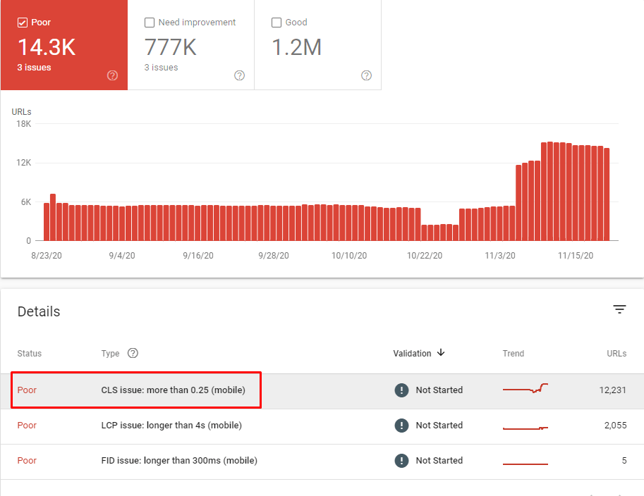
Because of Google’s Page Experience Algorithm based on Web Page Loading Performance with user-centric metrics such as Core Web Vitals, Cumulative Layout Shifting has become an important User Experience, Conversion Rate Optimization, and Search Engine Optimization term. In this guideline, you will find answers for the definition, measurement, scoring, and improvement methodologies for CLS.
The questions that are answered in this Cumulative Layout Shift (CLS) SEO Guide below:
- What is Cumulative Layout Shift (CLS)?
- How is CLS calculated?
- What is a good CLS score?
- How does CLS impact user experience?
- How can I measure CLS on my website?
- What are some common causes of CLS?
- How can I reduce CLS on my website?
- What is the impact of images and videos on CLS?
- How does CLS differ from other web performance metrics?
- How does CLS affect search engine optimization?
- How does CLS impact mobile devices?
- Can CLS be measured in real-time?
- How does CLS relate to web accessibility?
- How does CLS impact e-commerce websites?
- How does CLS impact website bounce rate?
What is Cumulative Layout Shift (CLS)?
As an SEO, web developer, or website owner, it is important to understand the Cumulative Layout Shift (CLS) metric. The CLS metric evaluates how consistent a website’s layout remains over time and can be used to determine the overall user experience of your site. It computes all the separate layout shift scores for every unexpected layout shift that takes place during page loading and records them in a table. A high CLS score indicates that there are many unexpected shifts that can disrupt users while they attempt to interact with content on your site; this decreases user satisfaction levels and makes it difficult for them to follow what they are doing on your website. On the other hand, having a low CLS score means that minimal unexpected shifts occur, providing an improved user experience as content does not move around unexpectedly when users navigate through pages or sections of your site. This can be determined by looking at how many times each page has been loaded since its creation – if more than one load occurs then you should investigate why this might have happened as multiple loads could indicate instability within certain areas of your design structure, leading to increased CLS scores due to lack of consistency in layouts across different visits from same/different visitors.
In order to ensure optimal performance from both search engine crawlers & human visitors alike, it is essential for any webmaster/developer/owner to take steps towards improving their website’s cumulative Layout Shift Score (CLS). One way would be to use techniques such as lazy-loading images & videos, so elements don’t suddenly appear mid-way down long pages causing accidental clicks & confusion amongst viewers; another method involves using fixed positioning where possible, so elements stay put even after new items get added onto existing structures, ensuring stability throughout entire browsing session without disruption caused by sudden changes in position during navigation process. Finally, developers should always test their designs thoroughly before going live – making sure all components remain stable regardless amount of traffic being sent through the system, thus avoiding potential increase in undesired movement between objects resulting in higher overall CLS values potentially damaging visitor’s experiences, negatively impacting conversions rates significantly too.
How is CLS Calculated?
As a web developer, it’s important to be aware of Cumulative Layout Shift (CLS) and its implications for website performance. CLS is calculated by summing the individual layout shift scores for every viewport unexpected layout shift that occurs during the entire lifespan of the page. The impact fraction is determined by measuring how much space on viewport unexpected viewport an element takes up, the distance, while the distance fraction measures how far it moved in relation to viewport height. A good rule of thumb is to aim for a CLS score lower than 0.1 as this indicates minimal disruption from unexpected shifts in content or visuals on your website pages which can negatively affect user experience and engagement with your site overall.
For SEO purposes, having low CLS scores are also beneficial as Google has recently announced that they will use this metric when evaluating websites’ rankings in search results; thus, improving your site’s CLS score could potentially help boost visibility online and attract more organic traffic from potential customers or clients who may be searching keywords related to what you offer! As such, incorporating strategies like lazy loading images into any new developments you make can help reduce unnecessary shifts caused by large files being loaded onto pages all at once – resulting in improved user experience along with better SEO outcomes over time.
What is a Good CLS Score?
As a web developer or website owner, it is important to understand the importance of Cumulative Layout Shift (CLS) and its impact on user experience. CLS measures how many content shifts around while users are viewing a page. The Web Vitals team at Google recommends that websites aim for a CLS score of less than 0.1, as this is considered to be an acceptable threshold for visual stability and user experience. A score of 0 is ideal but can be difficult to achieve in practice due to various factors contributing towards layout shifts such as images loading slowly, dynamic content is added after the initial page load, etc.
In order to maintain good CLS scores, developers should pay close attention when building pages with elements that could cause layout shift like ads or other third-party scripts – use techniques such as setting sizes for images upfront, so they don’t change the size once loaded onto the page; using CSS position: sticky instead of JavaScript; avoiding large font size changes between headings, etc. Additionally, tracking metrics related not just only CLS but also FID (First Input Delay), LCP (Largest Contentful Paint) & TTI (Time To Interactive) helps gain better insights into overall performance & UX quality on your website/application.
Overall having low cumulative layout shift scores ensures smooth transitions between different states in your application which gives end users seamless experiences without any unexpected jumps making them more likely to stay longer and come back again leading to higher conversions rates or whatever goal you have set up
How Does CLS Impact User Experience?
For SEO, Web developers and website owners, Cumulative Layout Shift (CLS) is an important factor to consider when designing or optimizing a website. A high CLS score can have a significant impact on user experience by causing unexpected layout shifts that are disruptive and frustrating for users. These layout shifts can make it difficult for users to complete their intended task, particularly on mobile devices where screen sizes are smaller and control over interactions is less precise. Furthermore, these unexpected shifts can be especially challenging for those with visual impairments who may not be able to accurately locate elements that have moved unexpectedly.
On the other hand, having a low CLS score indicates that your website has minimal unexpected layout shifts which provides an improved user experience overall. By reducing disruptions caused by these sudden changes in design elements like buttons or text boxes you will create more positive experiences which will help drive engagement with your content as well as increase conversion rates from visitors into customers/clients etc.. To ensure your site’s CLS scores remain low web developers should use techniques such as reserving space ahead of time before loading images so they don’t push existing content out of place once loaded; setting all font sizes in relative units rather than absolute values; avoiding dynamic resizing of page elements; using CSS transitions when changing element properties instead of JavaScript-based animations where possible etc..
By taking the time to properly optimize their websites according to SEO best practices webmasters can ensure they provide their visitors with great experiences while also increasing traffic & conversions at the same time.
How Can I Measure CLS on My Website?
There are several ways to measure Cumulative Layout Shift (CLS) on a website:
- Browser DevTools: Most modern web browsers come with developer tools that allow you to measure CLS, as well as other web performance metrics. In Google Chrome, for example, you can use the Lighthouse tool to measure CLS.
- Web Vitals JavaScript library: Google has developed a JavaScript library called Web Vitals that allows you to measure and track CLS and other web performance metrics on your website.
- Google Analytics: You can use Google Analytics to monitor CLS and measure it with the help of the “Web Vitals” function in your Google Analytics account.
- Google Search Console: Google Search Console gives you information about the CLS score of your website in the “Core Web Vitals” section of the platform.
- Third-party tools: There are several third-party tools such as GTmetrix, SpeedCurve, and Calibre that allow you to measure and track CLS and other web performance metrics.
It should be noted that CLS measurement on your website will more effective if you test it with real devices and real-world conditions, which may differ from a synthetic testing method.
What are Some Common Causes of CLS?
Cumulative layout shift CLS is a problem that can affect the user experience of any website it occurs when elements on the page are shifted around unexpectedly which can be disorienting and distracting for visitors as a web developer or website owner It’s important to understand some of the common causes of CLS, so you can take steps to prevent them from occurring on your site one common cause is loading images or videos without specifying their dimensions beforehand without knowing how much space these elements will occupy they can cause layout shifts as soon as they’re loaded, and the page reflows to accommodate them additionally asynchronous content loading such as ads or widget scan also lead to unexpected layout changes if not implemented correctly likewise with dynamic content updates using JavaScript and third-party scripts like analytics tools that aren’t properly integrated into your codebase finally hiding elements without first defining their size in advance may also result in unexpected layout shifts when those hidden items are revealed later on down the line fortunately there are ways you can mitigate against CLS issues arising on your site by taking proactive measures such as setting image sizes before loading them onto pages implementing asynchronous content correctly making sure all fonts have been applied prior to rendering pages ensuring all dynamic updates have been accounted for ahead of time etcetera keeping an eye out for potential sources of CLS will help ensure users don’t encounter any unwelcome surprises while browsing your site
How Can I Reduce CLS on My Website?
A website may reduce its cumulative layout shift (CLS) in a number of ways, including the following:
Define the sizes of images and videos: If you specify the dimensions of images and videos in your HTML or CSS, you can prevent layout shifts that are caused when the page reflows to accommodate them. This can be done by defining the sizes of the images and videos.
Set aside space in your layout for advertisements and widgets. If you do this, you’ll be able to avoid having your layout shift as a result of the loading of the advertisements and widgets.
Employ a Layout System Employing a layout system such as a CSS grid or flexbox can make it simpler to control layout shifts and maintain a stable layout.
Take advantage of the element’s aspect ratio: By making use of the aspect ratio, the element can be predicted by its layout.
Avoid updating the content dynamically If at all possible, you should avoid updating the content dynamically because doing so can cause shifts in the layout. If you have no choice but to update the content dynamically, you should employ techniques such as animation to reduce the amount of disruption caused by the layout changes.
To speed up the loading of web fonts, you should make use of the font-display property available in CSS. This property allows you to control how web fonts behave while they are loading.
Monitor and evaluate CLS Scores: On a regular basis, monitor and evaluate your CLS score, and then make use of the data to determine and address the factors that contribute to the shifting of layouts on your website.
Test on real devices It is important to test your website using real devices and in real-world conditions, as the results of synthetic testing may not be accurate representations of what happens in the real world.
Define the disposition of your products: Try to make use of your web metrics in order to define a successful implementation of your product. Assess the user
Note that while these are general steps that can help reduce CLS, the specific steps you need to take to reduce layout shifts will depend on the website and how it is implemented. It is important to keep this in mind because the specific steps you need to take to reduce layout shifts will vary depending on the website.
What is The Impact of Images and Videos on CLS?
As a web developer or website owner, it is important to be aware of the impact that images and videos can have on Cumulative Layout Shift (CLS). Images and videos often require more space than text, encoded they may not be fully loaded or rendered when the page first loads. This can cause layout shifts, as the browser doesn’t know how much space to reserve for them until they are actually loaded. Additionally, if an element’s aspect ratio is not properly set in HTML or CSS code, then this too could result in a layout shift when loading video content.
Fortunately, these issues can easily be avoided by specifying dimensions for both images and videos using HTML/CSS coding techniques. Doing so will ensure that enough room is reserved ahead of time, so there won’t be any unexpected changes once the media elements are finally loaded into viewport memory storage locations such as RAM cache, etc. additionally, setting correct aspect ratios will also help prevent any potential CLS-related problems from occurring due to unexpected size changes during video playback sessions which users might experience on certain devices with limited display resolutions, etc.
In conclusion, it’s clear that having proper image & video sizing information specified within your source-code files helps ensure smooth user experiences without causing unintended layout shifts while browsing through pages hosted on our websites & applications – making sure we keep those dreaded CLS metrics low.
How Does CLS Differ From Other Web Performance Metrics?
CLS (Cumulative Layout Shift) is an important web performance metric that measures the visual stability of a page. It helps website owners understand how stable their pages are, and how much unexpected layout shifting occurs when visitors view them. This can be especially useful for websites with many dynamic elements, such as ads or content sliders, which can cause frequent layout shifts that disrupt the user experience.
When measuring CLS scores on a website, it’s important to consider all the individual elements that contribute to it- including images loading slowly or in an unexpected order; text reflowing due to font size changes; and buttons moving unexpectedly when clicked on by users. All these factors add up over time and affect overall page stability – so understanding what causes them is key for improving CLS scores and providing better user experiences on your site.
Overall, Cumulative Layout Shift offers valuable insights into the visual stability of webpages – helping SEO’s optimize their sites more effectively, while also ensuring visitors have smooth interactions with them from start to finish! By monitoring this metric closely, you’ll be able to identify any areas where improvements need to be made quickly before they impact visitor engagement negatively – ultimately leading to higher rankings in search results too.
How Does CLS Affect Search Engine Optimization?
To ensure that a website’s SEO is not impacted by CLS, it is important for webmasters and content creators to take the necessary steps to reduce their page’s CLS score. This can be done by avoiding large font or image changes, minimizing animations on pages, and ensuring that any ads are properly sized and placed. Additionally, using modern coding techniques such as HTML5 can help minimize layout shifts caused by code errors. Finally, regularly testing the site with tools like Google PageSpeed Insights will provide feedback on how well its performance measures up against industry standards.
By taking these steps to reduce your website’s Cumulative Layout Shift score, you will be able to increase user experience while also improving your chances of being ranked highly in SERPs due to Google’s decision of incorporating this metric into its search algorithm as a ranking factor. Ultimately this means better visibility for your website which translates into higher traffic numbers.
How Does CLS Impact Mobile Devices?
Cumulative Layout Shift (CLS) is a metric that measures the amount of unexpected layout shifts on webpages, and it can be more significant on mobile devices than desktop devices. This is because of several factors, such as the smaller screens of mobile devices, which can make layout changes more visible and disruptive to users. Additionally, touch interfaces used by most modern smartphones are much more sensitive to layout shifts compared to traditional mouse-and-keyboard interactions found in desktops or laptops. Mobile networks also tend to be less stable than wired connections due to their reliance on cellular signals; this makes them prone to unexpected page reloads, which could result in higher CLS scores. Lastly, mobile hardware generally has limited resources like processing power and memory when compared with desktop computers; this means they may not handle sudden changes in webpage layouts efficiently enough, resulting again in higher CLS scores overall.
To mitigate these issues while developing websites for mobile users, it’s essential that developers test their pages thoroughly during the development stages so any potential shift problems are identified early before going live online. Also, best practices should be followed such as reserving space for images even if they haven’t loaded yet so there won’t be any surprise jumps when content appears suddenly after loading completely from remote servers or caches, etc. Finally, using techniques like lazy loading where possible will help minimize resource usage while still providing an optimal user experience across both desktop and mobile platforms alike.
Can CLS be Measured in Real-Time?
Measuring Cumulative Layout Shift (CLS) in real-time can provide valuable insights into the visual stability of a website and the user experience it provides. CLS is an important metric for gauging how stable a webpage appears to users, as sudden layout shifts can lead to confusion and frustration while navigating through webpages. By measuring CLS in real-time, SEOs, website owners and content writers are able to identify potential problems with their sites that could be causing unexpected layout changes or disrupting user navigation.
To get a comprehensive understanding of the user experience on your website, test it on different devices such as mobile phones or tablets with various screen sizes and network conditions. This will help you determine whether there are any issues related to layout shifts that need addressing across all platforms used by your visitors. Additionally, keep track of any changes made, so you know which areas might have been affected by new code or design elements added recently; this makes it easier for you to pinpoint where potential issues may lie if they arise after implementation.
Finally, implementing best practices when designing websites is essential in order to reduce the likelihood of experiencing undesirable page layouts during loading times or other events like resizing windows, etc. For example, using CSS Grid instead of Flexbox when creating layouts helps ensure more consistent results regardless of device size; also avoiding dynamic DOM manipulation wherever possible will help minimize unexpected shifts due to JavaScript running at runtime etcetera. Taking these steps minimizes disruptions experienced by users visiting your site ensuring better overall satisfaction with their browsing experiences – thus making them more likely to return again.
This page contains more information about testing, here are some examples of it,
- Device tests: This test involves checking the website on different types of devices such as smartphones, tablets, laptops, and desktops. By testing on multiple devices, developers can identify layout shift issues that may occur specifically on certain types of devices. This will help ensure that the website provides a consistent and stable experience for users regardless of the device they are using.
- Screen size tests: This test involves checking the website on different screen sizes, such as small, medium, and large screens. This will help identify layout shift issues that may occur specifically on certain screen sizes. It’s important to test on different screen sizes, as the layout of the website may be affected by the screen resolution and size.
- Network condition tests: This test involves checking the website on different network conditions, such as low-bandwidth, high-latency, and offline connections. This will help identify layout shift issues that may occur specifically on less stable networks. This is important as some elements of a website may load slower on certain network conditions, which may cause layout shift issues.
- Change tracking tests: This test involves keeping track of all the changes made to the website, such as updates to the design, code, or content. After each change, the CLS score should be tested to identify which changes are causing layout shift issues. This will help developers quickly identify and fix any issues that may arise.
- Best practice tests: This test involves implementing best practices such as reserving space for images that are yet to load and using a font loading strategy. Implementing best practices will help to reduce the likelihood of layout shift issues. This is important as best practices help to optimize the loading time of website elements and avoid unexpected layout changes that can cause layout shift issues.
The CLS score can be measured in real-time and how it can improve the visual stability of the website and the user experience it offers by these methods.
How Does CLS Relate to Web Accessibility?
CLS (Cumulative Layout Shift) relates to web accessibility in that it affects the overall user experience and can create obstacles for users with disabilities. A high CLS score can make it difficult for users to navigate and interact with a website, particularly those with visual impairments or motor control issues.
When the layout of a website changes unexpectedly, it can be difficult for users with visual impairments to locate and interact with specific elements. For example, if a button moves while a user is trying to click on it, the user may accidentally click on the wrong button or become frustrated and give up. Similarly, users with motor control issues may have difficulty interacting with elements that suddenly move or change layout.
Additionally, a website with a high CLS score may also be less usable for users with cognitive disabilities, as unexpected layout changes can make it more difficult to understand and use the website.
To ensure that a website is accessible to all users, it is important to minimize layout shifts and provide a stable and predictable layout. This can be achieved by implementing best practices such as reserving space for images that are yet to load and using a font loading strategy, as well as testing the website on different devices, screen sizes, and network conditions.
It is important to note that web accessibility is a vast topic, and while minimizing layout shift is important, it is only one aspect of it. It is also important to consider other areas such as providing alternative text for images, providing good contrast, making sure keyboard navigation is possible, and providing clear and easy-to-read text.
How does CLS impact e-commerce websites?
CLS (Cumulative Layout Shift) can have a significant impact on e-commerce websites, as it can affect the user experience and ultimately impact conversion rates. A high CLS score can cause frustration and disorientation for users, making it difficult for them to find products or complete a purchase. This can lead to users leaving the website, resulting in lost revenue. Additionally, it can create obstacles for users with disabilities, and negatively impact the trust and credibility of an e-commerce site. To minimize the impact, it is important to implement best practices such as reserving space for images and using a font loading strategy, and testing the website on different devices, screen sizes, and network conditions. Also, implement a clear and consistent layout with clear calls to action, and optimize the website for mobile devices.
How Does CLS Impact Website Bounce Rate?
Cumulative Layout Shift (CLS) is an important factor that can have a major impact on the bounce rate of a website. When the layout of a website changes unexpectedly, it can make it difficult for users to find what they are looking for and cause them to leave quickly, resulting in an increase in bounce rate. A high bounce rate implies that the user experience offered by your website is not satisfactory and may also create difficulties for people with disabilities.
To reduce CLS’s effect on your site’s bounce rate, there are several best practices you should implement such as reserving space for images and using font loading strategies; testing your website across different devices, screen sizes and network conditions; having clear layouts with consistent calls-to-action, so users can easily navigate through their search process without any disruption or confusion; lastly making sure all content loads properly before displaying them on the page. All these steps help minimize layout shifts, which ultimately leads to lower bounces rates because visitors stay longer when they find what they need more quickly due to better navigation within your site’s pages.
The overall goal here is simple: improve the user experience while reducing CLS related issues, so visitors spend more time engaging with content rather than leaving due to unexpected disruptions caused by sudden layout shifts or slow loading times etc., thereby improving both visibility & performance metrics like Bounce Rate which helps SEO rankings & conversions over time. By following these tips mentioned above you will be able to ensure that Cumulative Layout Shifts don’t affect visitor engagement negatively thus helping maintain low Bounce Rates & improved User Experience scores leading towards higher Rankings & Conversions.
Why Does Cumulative Layout Shift (CLS) Occur?
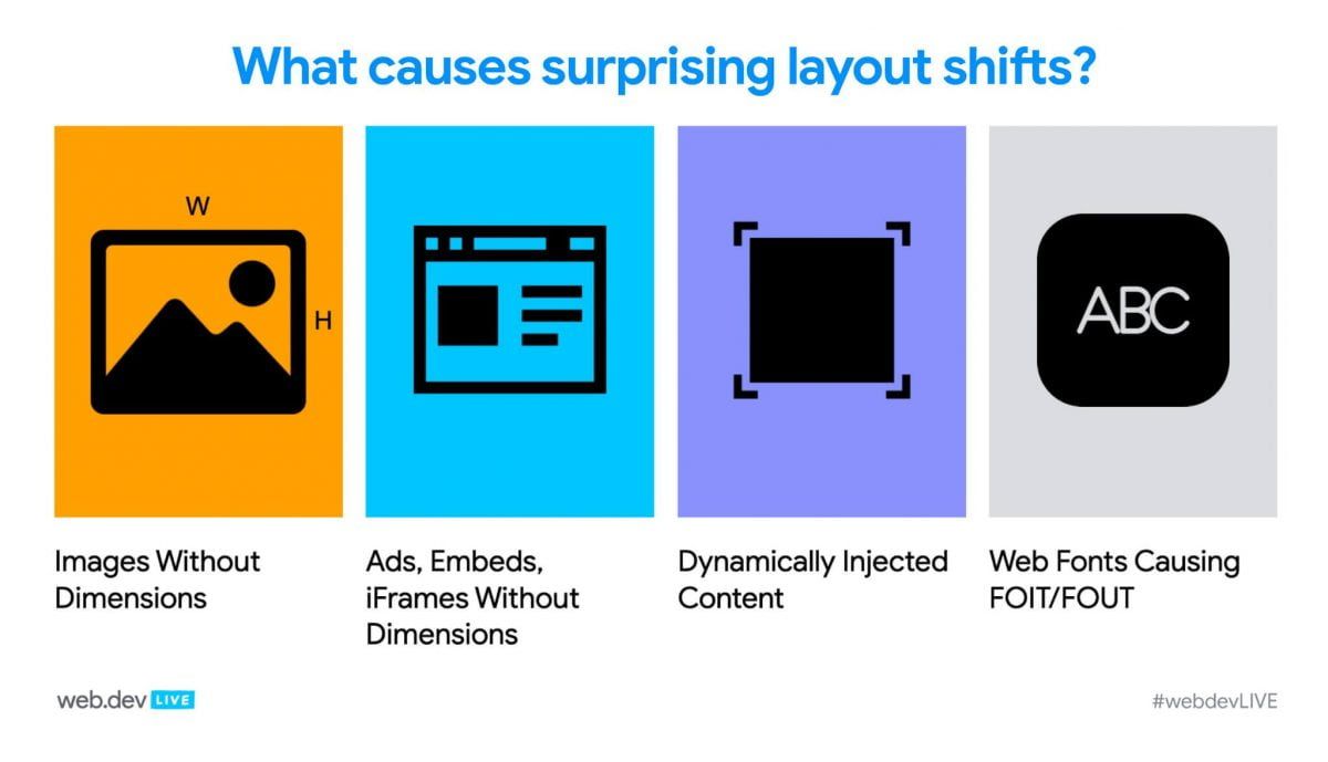
Cumulative Layout Shifting can happen because of several reasons as listed below.
- Uploading Page Resources Asynchronously into the web page.
- Videos, iframes, images, and ads without Height and Width values
- Dynamically uploaded content
- Late Visualization of Web Fonts i.e. FOIT / FOUT
- Waiting for a Network Approval before DOM Loading
Another reason for Cumulative Layout Shif is the web page resources loaded and working differently in the Production and Development environment. Mostly in the Development Server and phase, resources are loaded quickly from the local server and the local cache. This situation creates the feeling that there is no problem on the page. However, in the production environment, users may be exposed to much slower loading pages and also Layout Shifting with a different internet connection and device variation possibilities. Because of this situation, an SEO and a Developer should perform Page Speed and User Experience tests with realistic simulations.
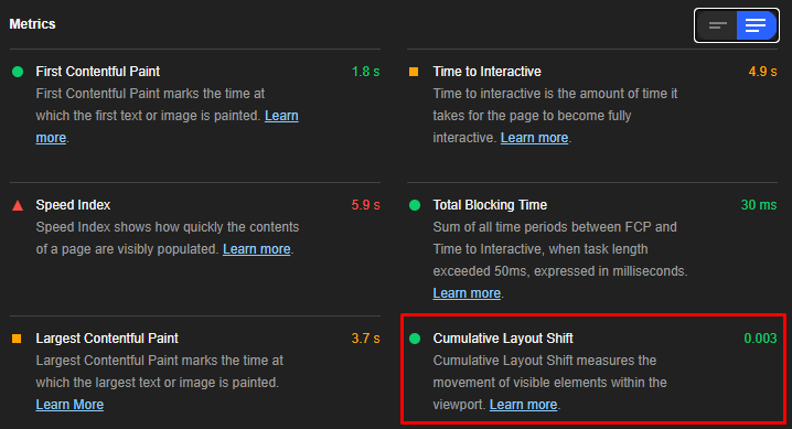
To learn more about Core Web Vitals and user-centered Web Page Performance terms and methodologies, you may read the guidelines below.
- What is Largest Contentful Paint?
- What is the First Input Delay?
- What is Time to Interactive?
- What is Time to First Byte?
What is Distance Fraction for CLS?
Distance Fraction measures how many percent an unstable element moves relative to the magnitude of the viewport. The big dimension that the viewport has is important in Distance Fraction. For example, for an unstable element that moves 30% downward on a phone screen, the Distance Fraction is 0.30.
Distance Fraction can occur horizontally or vertically.
Sample Cumulative Layout Shifting Calculation Below.
Impact Fraction (0.60) * Distance Fraction (0.30) = Cumulative Layout Shifting (0.180)In this example, our CLS Score is between Good and Poor.
Why is Distance Fraction Important for CLS?
Initially, Cumulative Layout Shifting was calculated only with Impact Fraction, but in the latter process, the Distance Fraction concept has been invented to update the Cumulative Layout Shifting (CLS) formula with a better layout shifting comprehension. Thus, the big web page components that shift didn’t affect the Cumulative Layout Shifting Score so much unless they shift too much.
What is the Difference between Expected and Unexpected Layout Shifts?
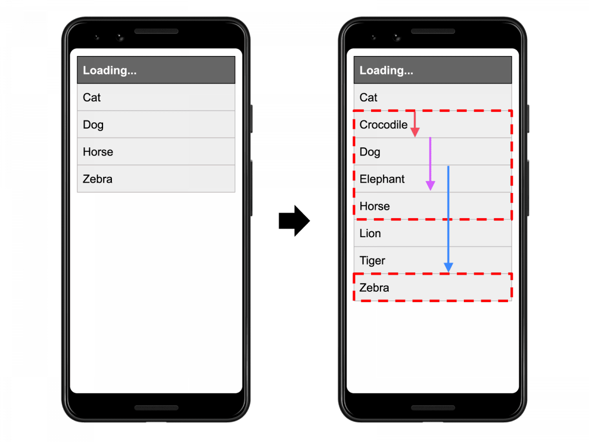
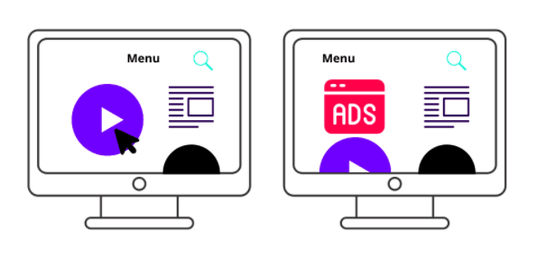
Cumulative Layout Shifting caused by Unstable Elements is a user-centric performance metric that only applies to unexpected layout shift events. Also, all layout shifts are not bad, sometimes web page components change their start position as they are being planned in the UI.
Layout Shift Events That Started by the User
It is good if a layout shifting event is experienced only at the time the user expects it, the way he/she wants. Expected and desired layout shifting events can be triggered by clicking a button, clicking a link, entering data in a search bar, or signing up for a newsletter.
For example, it is better to show a user a load bar or load indicator after a Call to Action (CTA) operation, then show the result when the action is complete. Thus, the user can wait to know that the transaction is taking place. At this point, if no loading indicator is used, the user may click elsewhere thinking that the process has not taken place. The Loading Indicator also prevents components on a web page from changing suddenly. Thus, a smoother user experience (UX) is provided.
Layout Shifting is a situation expected and desired by the user when it can improve the user experience.
Natural and Smooth Animations and Transitions
Content that changes its start position without any expectation or warning always creates a bad user experience and disturbs the users’ satisfaction. But, animations and transitions that shift the content on the web page gradually and naturally create user satisfaction. Animations and transitions may change the web pages’ components’ initial positions during their playing time, but since the user knows and expects these types of shifts, these types of animations and transitions help users to understand the web page and the process.
What are the Differences Between Bad and Good Layout Shifts?
The differences between bad and good layout shiftings are below.
- Bad Layout Shiftings are experienced suddenly without waiting and asking by the user.
- Poor Layout Shifting damages the user experience and reduces user satisfaction.
- Good Layout Shifting events can be initiated by users.
- Good Layout Shifting events can be detected by users.
- Good Layout Shifting Events make it easy for users to understand the page.
- Cumulative Layout Shifting (CLS) Score measures only bad layout shifting events.
How to Measure Cumulative Layout Shift?
Cumulative Layout Shifting can be measured both by examining real user experiences and with web page loading simulators. The following tools can be used for Cumulative Layout Shifting (CLS) Measurement.
- Chrome User Experience Report
- PageSpeed Insights
- Search Console (Core Web Vitals Section)
- Chrome DevTools
- Lighthouse
- Pingdom
- WebPageTest
- SpeedCurve
- Dareboost
- GTMetrix
Web page loading simulators measure the Cumulative Layout Shifting (CLS) Score only when the web page is loaded, but the CLS is measured during the “lifespan” of a session on a web page. Therefore, Field Data, which contains real user metrics, is more important than Lab Data.
How to Measure Cumulative Layout Shift Manually?
Google’s Core Web Vitals Javascript Library can be used to measure Cumulative Layout Shift. With Puppeteer, it is possible to perform CLS measurement for all web pages in a loop with the “getCLS ()” function.
import {getCLS} from 'web-vitals';

getCLS(console.log);
Measuring CLS via Custom Javascript Codes are possible, but using Core Web Vitals Javascript Library is the most efficient methodology.
How to Improve Cumulative Layout Shifting?
For most of the websites, following the methods below is enough to fix the Cumulative Layout Shifting issue.
- Always give the required height and width values to images, videos, and ads.
- If the required width and height values cannot be given to the images, give a default size to the web page elements related to “unsized-media feature policy”.
- Never place another web page component on top of the uploaded content, except if it happens through user interaction.
- Communicate with the user using meaningful animations that move according to the context, so that the layout shifting process is understandable.
To better understand Cumulative Layout Shifting Optimization, it is necessary to better understand the causes of CLS.
Images without Height and Width Value
The height and width values given to the images allow the browser to know in advance how much space the image will take up. Thus, it can place all the elements on the web page as they should. If the visuals are not given a height and width value, the “CSS Aspect Ratio Box” feature should be used.
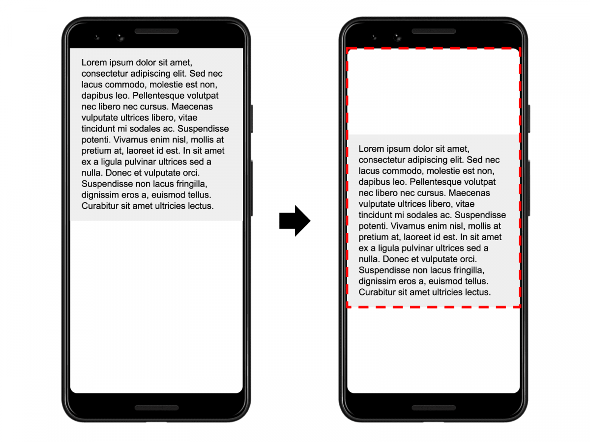
Giving a height and width value to an image also reduces the “reflow” and “re-layout” process. Using “width” and “height” attributes for images to reduce Cumulative Layout Shifting is more efficient than using “width” and “height” properties for images in CSS.
If the browser is delayed to load the relevant CSS File, the images may cause other web page elements to shift in the viewport. At the same time, the “reflow” and “re-layout” process is prolonged with the “width” and “height” values appearing later.
CSS Aspect Ratio value becomes important when height and width values are not known for the image. Any visual with Aspect Ratio determination can have with and height values in any way.
- If the image is 220 pixels wide (16/9), its height will be 391 pixels with aspect ratio.
- If the image is 391pixel high (16/9), its width will be 220 pixels with an aspect ratio.
Thus, the browser can preset the web page layout by having the required values in default for both width and height.
In modern applications, it is better to use height and width attributes in HTML Document to reduce Cumulative Layout Shifting. At the same time, User-agent Stylesheets that are being used by the browsers are usually educated for the images without dimensions with the aspect ratio.
If you want to keep an image the width of the container, the “width: 100%; height: auto;” You can use the values. Thus, by calculating the height value with “auto”, the CLS can be prevented by reading the CSS Document or the relevant HTML Code line.
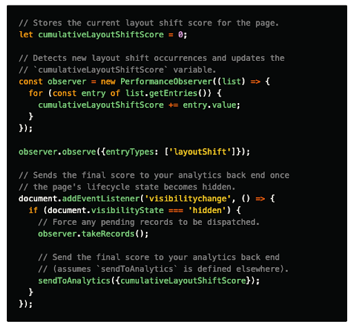
How to Prevent CLS Using Responsive Image?
When working with Responsive Images, attributes such as “srcset” or “media” are used to prevent CLS. It uses the “srcset” attribute by downloading the most appropriate image according to the width of the browser viewport, and places it using during the “layout calculation”.
Below is an example of srcset.
<img width="1000" height="1000"
       src="image-1000.jpg"
    srcset="image-1000.jpg 1000w,
            image-2000.jpg 2000w,
            image-3000.jpg 3000w"
           alt="Image descriptive text"/>
In this example, the browser downloads the image-1000.jpg image on a 1000 pixel widescreen. The height value also changes at the rate determined according to the related viewport width.
Below is an example with a media attribute.
<picture>
  <source media="(max-width: 792px)" srcset="car-480w-cropped.jpg">
  <source media="(min-width: 793px)" srcset="car-800w.jpg">
  <img src="car-800w.jpg" alt="Car Modal and Price">
</picture>
In this example, we show a cropped variant of the car image on 792 pixels wide and less wide screens. On screens with a width of 793 pixels and above, we use the normal version of the image.
Cumulative Layout Shifting and Advertisements
Ads often don’t have a height or width value. The reason for this is to generate more revenue by increasing the click-through rate. At the same time, the lack of the size of the ads provides an increase in price by allowing more advertisements to compete during the auction. Therefore, ads are one of the most important factors for Cumulative Layout Shifting.
During the lifecycle of a web page, advertisements can create CLS in many ways.
- When resizing an advertisement container with a client-side Javascript.
- When an advertisement container is dynamically injected into the web page.
- When the Advertisement tag System resets the advertisement container.
- If an advertisement changes the size of the container div.
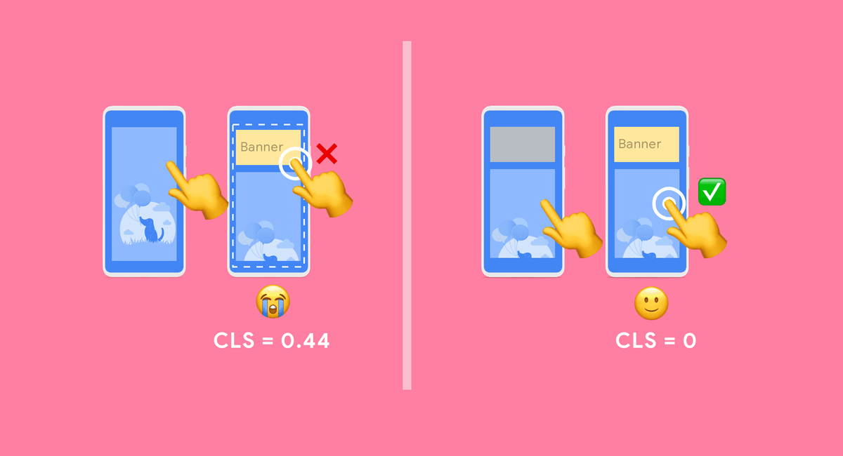
How to Prevent CLS for Ads Elements on the Web Page?
The methods below can be used for CLS in terms of Ads.
- Make room with CSS for the ads element to be loaded.
- When using sticky-ads, try loading them under the relevant elements so that the ads do not push the web page elements down.
- When the ads are not loaded, don’t let the space reserved for ads crash and disappear in front of the user, try using a placeholder.
- Calculate the overall size of the ads by collecting historical data and use the best possible container HTML div size.
Making a Static Slot for Ads
In this process, a larger container is set by calculating the sizes of the ads most likely to load. Thus, layout shifting is not experienced because HTML Container Div is larger than the size of the ad, but in this case, if the container HTML Div is too large, the white space ratio increases. For this reason, the layout calculation should be done as best as possible.
You can also consider serving smaller ads, but in this case, there is a higher chance of increasing the white space within the inclusive HTML div.
Keeping Ads Placement Off Top of Page
CLS can be largely avoided by keeping the ads placement off the top of the page. Because Ads loads late and don’t have a specific size, it can push down web page elements loaded before it. To avoid this situation, ads placement should not be at the top. Thus, even with Layout Shifting, fewer web page elements will shift and some of them will not be in the viewport, so the CLS score will decrease.
The Importance of Iframe and Embed for Cumulative Layout Shifting Optimization
Embeds or Embeddable widgets allow users to embed different web page elements such as various images, videos, or maps from different websites on a different web page. With embeddable content, the content of one website can appear on another website. The embeddable widget is divided into types as follows.
- Embed a specific HTML Div.
- Transforming and embed a specific Javascript Tag
- An inline HTML Snippet
- Iframe Embed
In cases where Social Media Posts or certain news content is embedded, the Cumulative Layout Shifting Score may increase because the size of the visual, video, or container HTML Div included in the embedded content is unknown. Since the area to be covered by the embedded content is unknown, the browser cannot pre-include the required area in the layout calculation and unexpected change of content elements’ place will occur.
How to Prevent Cumulative Layout Shifting for Iframe and Embed?
In order for Iframe and Embedded content not to generate CLS, the size of the Iframe must be known in advance and the relevant space must be left in advance on the web page. For this, the container HTML Div must be given the required height for Iframe and Embed in advance.
Apart from the height that can be given to the container HTML Div, using a placeholder may also be a solution.
The Iframe and Embeddable Content area can be held by a placeholder of the same height until content is loaded. In both inclusive HTML Div and Placeholder solutions, media queries and device-based viewport differences should be calculated.
Dynamic Content Injection and Cumulative Layout Shifting
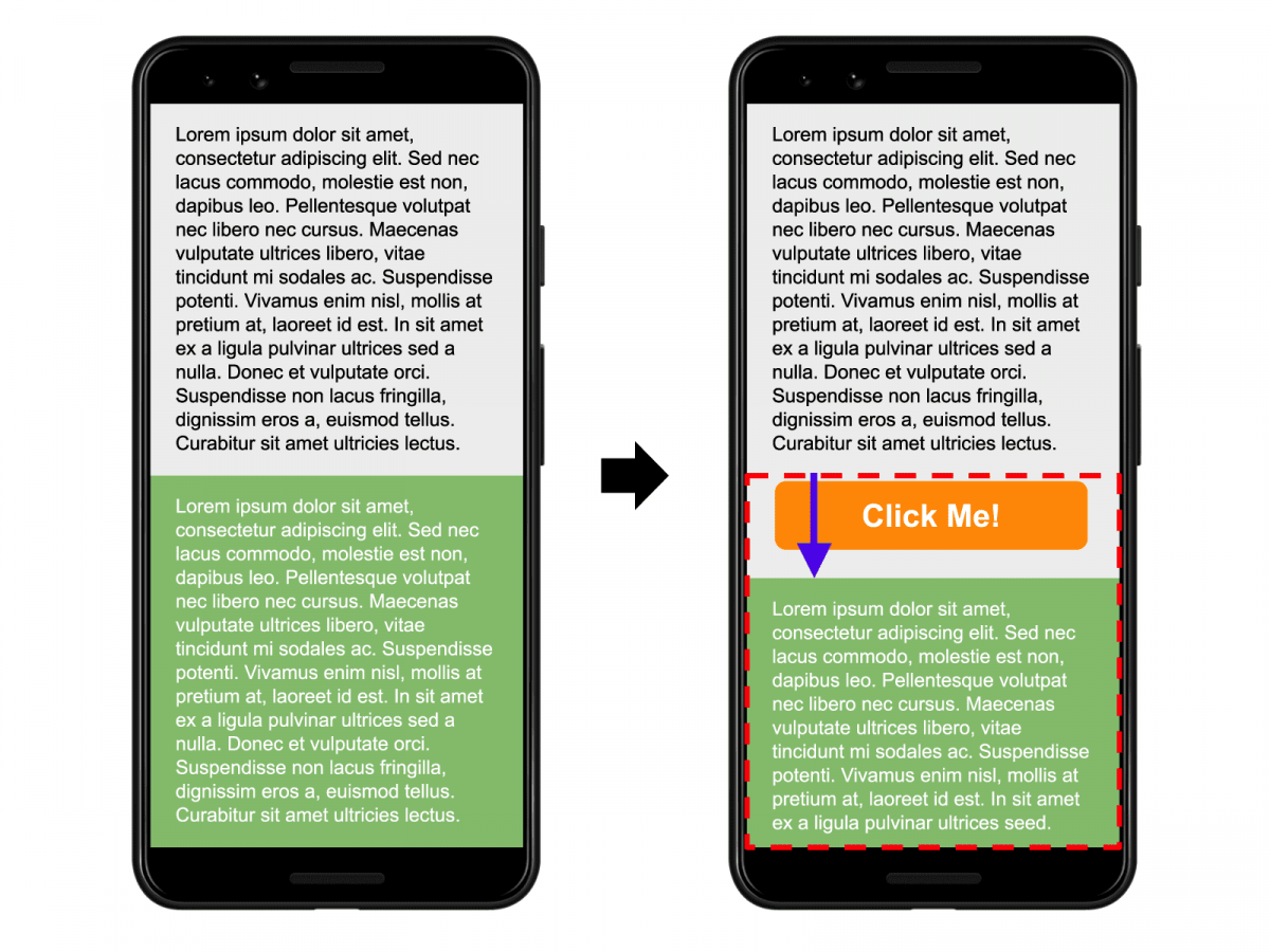
Unless there is a user interaction involved, do not place other content on top of existing content. Thus, the most important CLS Condition that may occur is prevented. The Cumulative Layout Shifting (CLS) problem experienced due to Dynamic Content Injection is especially valid for banners and forms, there are some examples below.
- More Related Content Widgets
- Read That Content Banners
- Newsletter Sign up Banners
- Be a member CTAs
- Install the App
- GDPR Notice for the users
- Campaigns and Special Offers
If you have applications of this type that change the User Interface and affect User Experience, calculate the height of the area where the banners, forms, and CTA Elements will be loaded in advance and inform the browser so that when the relevant elements are loaded, the web page components do not change their positions.
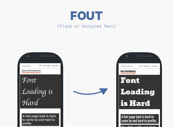
Web Fonts, FOUT, FOIT and Cumulative Layout Shifting
During the installation of web fonts, Cumulative Layout Shifting can be experienced in two ways.
- During the replacement of the font style used by the browser with the font used by the website, FOUT (Flash of Unstyled Text).
- In case the browser does not display any text until the font of the website is loaded, ie FOIT (Flash of Invisible Text).
Font-display CSS Property, which is important for Page Speed Improvement for such situations, is also gaining importance for Cumulative Layout Shifting (CLS).
Font-display CSS Property takes CSS Values in the form of auto, swap, block, fallback, optional. All options are other than “Optional” cause the browser to experience Cumulative Layout Shifting (CLS) by repeating the re-layout and reflow process. “Font-display: optional;” In addition to the use of CSS Property and Value, you can use “@import URL (font-url.css);” It is important not to take the form. Importing font files from CSS Files is negative for both page speed and CLS.
Also, it is better to “preload” the font files in HTML Documents with browser hint. Thus, font files load earlier. Font file loaded earlier reduces the probability of FOUT, FOIT and Layout Shifting.
In terms of Font Files and Layout Shifting, the best practice is to use the Font-display: optional and the “preload” attribute together.
Below you will see an example of how the pre-load attribute can be used for font files.
<link rel="preload" href="font-url.css" as="stylesheet" onload=this.rel='stylesheet'"Loading font files with both preload and font-display optional eliminates the possibility of layout shifting due to font files.

Animations and Cumulative Layout Shifting
Animations and Transforms can be costly for the browser to implement. In such a case, it should be known which CSS Triggers are less costly for layout, composite, and painting processes. Using CSS Properties for animations to be produced with @keyframe is beneficial for both web page loading time, performance, and Cumulative Layout Shifting.
Position, Scale, Rotation, Opacity, easy to apply to transform CSS Properties for browser. Each CSS Property will create a different user experience as it creates a different cost.
Below you will see how the “top, left” and “transform: translate” CSS Triggers play the same animation in two different ways.
While “top, left” CSS Triggers change the location of the web page component bit by bit, “transform: translate” changes it much more smoothly and with less performance cost. In order to avoid such situations, transform CSS values should be used as much as possible.
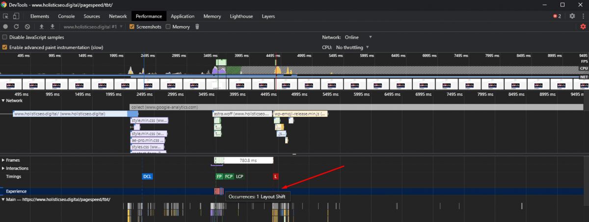
How to Examine Layout Shifting with Chrome DevTools
In the Experience and Summary sections of the Chrome DevTools Performance tab, the areas that create layout shifting appear with a rectangle, while Cumulative Layout Shifting Score is also included.
Below, you can see the CLS result and shifting elements of the relevant web page at the time of writing.
Last Thoughts on Cumulative Layout Shift, User-centric Performance Metrics, and Holistic SEO
Holistic SEO is a combination of programming and marketing values and habits. Cumulative Layout Shifting is one of the Chrome Web Vitals metrics that every SEO should focus on. If a web page stresses the users, its elements change place when they are about to be clicked, and if it contains too many unstable elements, it will disturb the users by stressing them. A page that annoys users and does not have stable elements will harm the credibility and prestige of the company as well as reduce the likelihood of users to convert. Web pages that fail to fulfill their purpose and do not create user-satisfaction will be dropped in rankings by other Search Engines, especially Google. SEO, UX, and Coding are unified in terms of user-centric performance metrics and Cumulative Layout Shifting is one of the best examples that fit in this context.
For this reason, it is important for an SEO to know the definition of Cumulative Layout Shifting, the measurement methodology, the improvement methods, and be able to lead Developer Teams.
- Sliding Window - August 12, 2024
- B2P Marketing: How it Works, Benefits, and Strategies - April 26, 2024
- SEO for Casino Websites: A SEO Case Study for the Bet and Gamble Industry - February 5, 2024


