In marketing, the term “call-to-action” or “CTA” describes the active impetus for realizing the economic or strategic goals of an advertising campaign. It asks the consumer to take concrete action.
The CTA often embodies the actual intention of a marketing campaign. Because as soon as the consumer has become aware of what the advertised product or service has to offer, he should feel a clear impulse to act – of course in the spirit of the campaign goal. The goal can be direct conversion, i.e. sales, or the generation of leads, i.e. the determination of relevant customer data. The call-to-action is the clear call for action by the consumer to react in the desired way.
A marketing campaign usually conveys important information about the benefits and advantages of a product or service in the form of appealing, striking word/image communication. This message reaches its potential consumers via the advertising media of various media such as online channels, print advertising media, or via radio or TV spots. Regardless of which media channel, a targeted advertising presence should culminate in a clear initiative that encourages the consumer to take action – ideally via channel-specific response instruments. A quick click on the corresponding button – and the process runs. In order to be sure that no prospect is lost, it is recommended in most cases to also install cross-channel response options.
Call to Action Component Examples and Direct Marketing
A call-to-action is a direct request to your visitor to perform a specific action.
The desired action can be anything. It also doesn’t necessarily have to be content-related:
- Sign up for your email updates
- Download your e-book
- Watch your video course
- Register for your webinar
- Share your content
- Read more posts
- Ask for a comment
- Follow on social media
- Click on a link
- Donate to your non-profit
- Register for your event
- Secure a coupon
- Register for your trial version
- Call for a first call
- Buy your product
- Order your service
- etc.
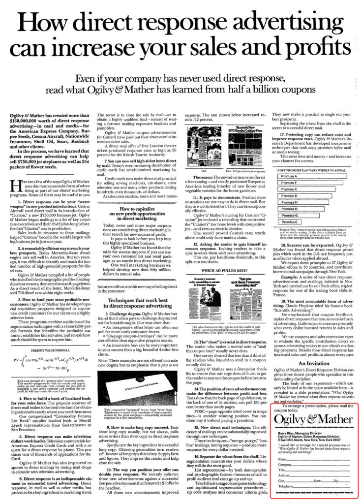
Calls-to-action originally came from direct marketing. In the end, there was always a crystal-clear call to action for the long direct mail items. Here’s a nice example from Ogilvy & Mather :
Purpose of Call To Action Components
Depending on which offer is advertised in a campaign, the call-to-action may contain calls for action for different reactions: whether it be a request to subscribe to the newsletter, to request more information material, to download or to arrange a consultation appointment – every action is an important step towards a campaign goal. The quickest success is of course the “Buy” button or at least the button with which an article is placed in the shopping basket.
Components of CTA and Success Factors
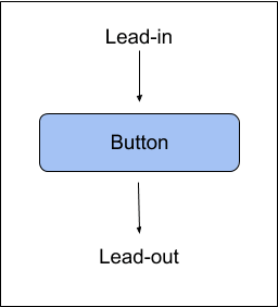
An important prerequisite for the call-to-action to lead to the desired success is the trust of the potential customer in the provider. It is, therefore, necessary that an interested visitor in the online shop has the opportunity to convince himself of the reliability of the provider. Even if the offer is so tempting, and abruptly appearing button with the words “Buy” would act as a deterrent. For this reason, a lead-in text gently leads prospective buyers to call-to-action. He answers all existing questions and in this way provides the necessary security for the purchase. After the button, a lead-out ensures that the trust built up is maintained, for example by pointing out that the customer can
This procedure is also particularly recommended in print applications, where the path to the ultimate purchase can be considerably longer than with a purely online purchase because no click on the button seals the process. Here it is particularly likely that doubts or forgetfulness of the potential buyer destroy the perfect preparation through marketing and advertising. Therefore, the trustful dialogue with the customer should continue after the purchase decision and be kept awake through accompanying campaigns.
Possible Uses of CTAs
Advertising alone is often perceived as very impersonal, so a call-to-action is usually a welcome step that keeps the customer’s attention awake and thus offers the chance to get a little closer to them. This step is felt to be all the more personal if it is embedded in a credible lead-in and a trust-building lead-out. In addition, the associated interaction gives the customer the opportunity to finally act independently without having to passively consume advertising. Therefore, the use of calls for action is recommended wherever pure advertising or product descriptions would otherwise tire the viewer’s attention and would diminish his interest in the offer. Which includes:
- Websites: Commercial or not, actions that engage visitors in the action keep their attention and make them stay to see if anything else is happening that might interest them. In particular, landing pages should provide targeted conversions with activities.
- Mailings and newsletters: Without an activity request, commercial emails would be the first candidates for the trash.
- Social media platforms like Facebook meet a target group that is literally waiting for action.
- Online text ads, for example, Google AdWords, attract attention through targeted action.
- Banner advertising is legitimized almost exclusively through action impulses. Otherwise, it is perceived as a nuisance.
- TV and radio spots bring measurable results by activating the target groups.
- Print ads are easily lost in the information overflow without an – at least accompanying – action.
Success factors of Call To Action Components
The placement of the CTA is critical to the success of an advertising campaign. It is particularly important that it is optically separate from the actual advertising message, so as not to get lost in it. The graphic design should also differ significantly from the look of the main message.
The wording must also be handled with skill. On the one hand, it is important that the request is short and clear, but on the other hand, it should be avoided that it is perceived as an order.
Furthermore, you should pay attention to a simple button look when using online. Again, you should avoid the target group feeling patronized.
In addition, artificial shortages can be used as accelerators. This is possible, for example, by statements such as “only a few items left in stock!” Or by giving real numbers and running backward in stopwatch mode.
There are three main success factors of Call To Action Components:
- Precise: Every call-to-action has only one purpose: to take your visitor one step further. Therefore, deliver a single action that your visitor should take.
- Specific: What exactly should your visitor do? Should he leave his email? To donate something? Or buy your product? Tell him exactly what he has to do.
- Simple – your visitor really has no time and little attention. So keep your CTA as simple as possible. Explain everything to him in simple words.
There are eight factors for designing a successful CTA Component:
- Communicate the benefits – What does your visitor benefit from when he clicks on the button or leaves his email? What does he get in return? What problem are you solving? What are the benefits? For example: “Receive free updates “.
- Deliver a unique selling proposition – what sets your CTA or the “offer” of the CTA apart from everyone else out there? What makes it special, unique? What is the USP? For example: “We are one of the leading inbound marketing blogs”.
- Answer Objections – Clicking on a CTA or leaving your email requires trust. This in turn raises questions and concerns. Is everything trustworthy and safe? For example: “No spam, don’t worry”.
- Use scarcity – scarcity makes people act. Because people hate to miss something. The word “now” alone can bring better results here. For example: ” Register now and get a 30% discount on the next order”.
- Use social proof – people tend to do what other people do. Therefore place numbers, testimonials, trust symbols, and “known from” banners in the CTA or around it. For example: “Join over 10,000 small businesses learning inbound marketing”.
- Start with active verbs – your CTAs should always be action-oriented. Avoid boring words like B. “Login” and use active verbs such as B. “Receive”, “Reserve”, “Test” etc. For example: ” Receive free updates”.
- Be personal – always use the first person. So not “Continue to your dashboard”, but “Continue to my dashboard”. This can really work wonders, as you can see in this case study. For example: ” Download my e-book now”.
- Highlight it visually – Of course, your CTA should stand out visually. It should therefore not be in line with the rest of the design. You do this by changing the color, size, whitespace, or text. Your CTA must stand out.
Where Should You Place the CTA?
If you want to use a CTA for lead generation, where on the website should you place it? Quite simply: Wherever possible. Here are some good spots that get a lot of attention:
- Home page
- Product page
- Service side
- “About Us” page
- Contact page
- Before, in or after each content
- As a popup
- In the blog sidebar
Just about every page should help your visitor and give a clear request for what to do next.
And where exactly should you place your CTA on the website? You can find this with a heat map tool such as B. Hotjar or Crazy Egg out. It shows you where most click land. These are good places for your call-to-action.
As a rough guideline, somewhere above, above the fold, is never wrong. On the other hand, Marketingexperiments’ study shows that sometimes below the fold works much better. So you just have to try it out. Every context is different.
What else needs to be considered with the call-to-action?
An important point in a CTA is optimization. A CTA may seem very well thought out when it is created – but it can only show whether it is actually used on the page. In order to be able to better estimate how effective a particular call to action is, it is worthwhile to formulate several variants. These are then placed on the page at the same time and only shown to a randomly selected part of the customers as part of an A / B test. In this way, the variants can be compared very easily, so that – assuming a correspondingly large number of test customers – you can easily determine the most effective variant. In addition, such tests should be repeated at regular intervals to ensure that the selected CTA is still working well.
Example of a Good Call-To-Action
Mozilla Firefox provides an example of a well-designed call-to-action:
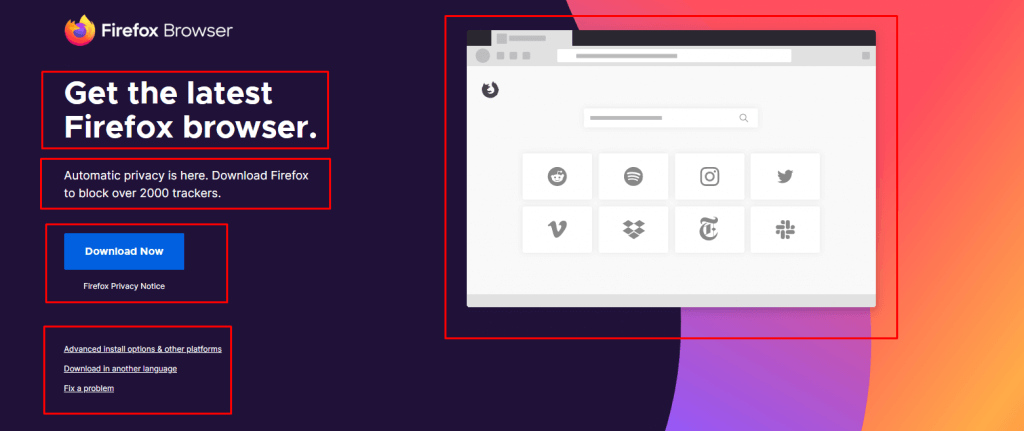
Here, the lead-in “Get the latest Firefox Browser” first arouses the purpose of the brand about the product and generates attention. The following button is simple and not too intrusive, but still distinguishes itself from the surroundings by its positioning and coloring, thus attracting the visitor’s eye. The lead-out refers to the data protection guidelines at Firefox and thus strengthens trust in the offer. In addition, the main product advantages are presented to convince the visitor of the download again.
The example shows that the components of the call-to-action shown above are not a must, but rather one of many ways to design a good call to action. For example, trust is built up here in the lead-out instead of in the lead-in, but nevertheless all the prerequisites for a successful action are given. The most important thing is that the call-to-action draws the attention of potential customers and at the same time looks trustworthy. How this is implemented in practice must be tailored to the respective situation and is up to each advertiser.
Last Thoguhts on CTA Optimization
A call-to-action is an important tool in online marketing that can have a major impact on the conversion rate. The customer is involved through the call for action and knows exactly how to take advantage of the respective offer. This makes it easier for him to make the decision and takes away any concerns, making a CTA more likely.
Call-to-action Component Optimization is an important part of Holistic SEO. From Lead Generation to Conversion Funnel or A/B Testing to Landing Page Design, CTA Components are the middle of every SEO Project.
As Holistic SEOs, we always follow the CTA Components’ effects on a web page’s conversion performance. If a web page can’t perform its purpose, it means that the web page can’t satisfy the user or the users’ search intent for the algorithm. We will continue to improve our CTA Guideline.
- Sliding Window - August 12, 2024
- B2P Marketing: How it Works, Benefits, and Strategies - April 26, 2024
- SEO for Casino Websites: A SEO Case Study for the Bet and Gamble Industry - February 5, 2024



Hi,
Your website is so amazing. And share with very useful information. I hope upcoming days to share extra useful information.
Thank you
Thanks for your kind comment and support, Abhishek.